year
2020
about
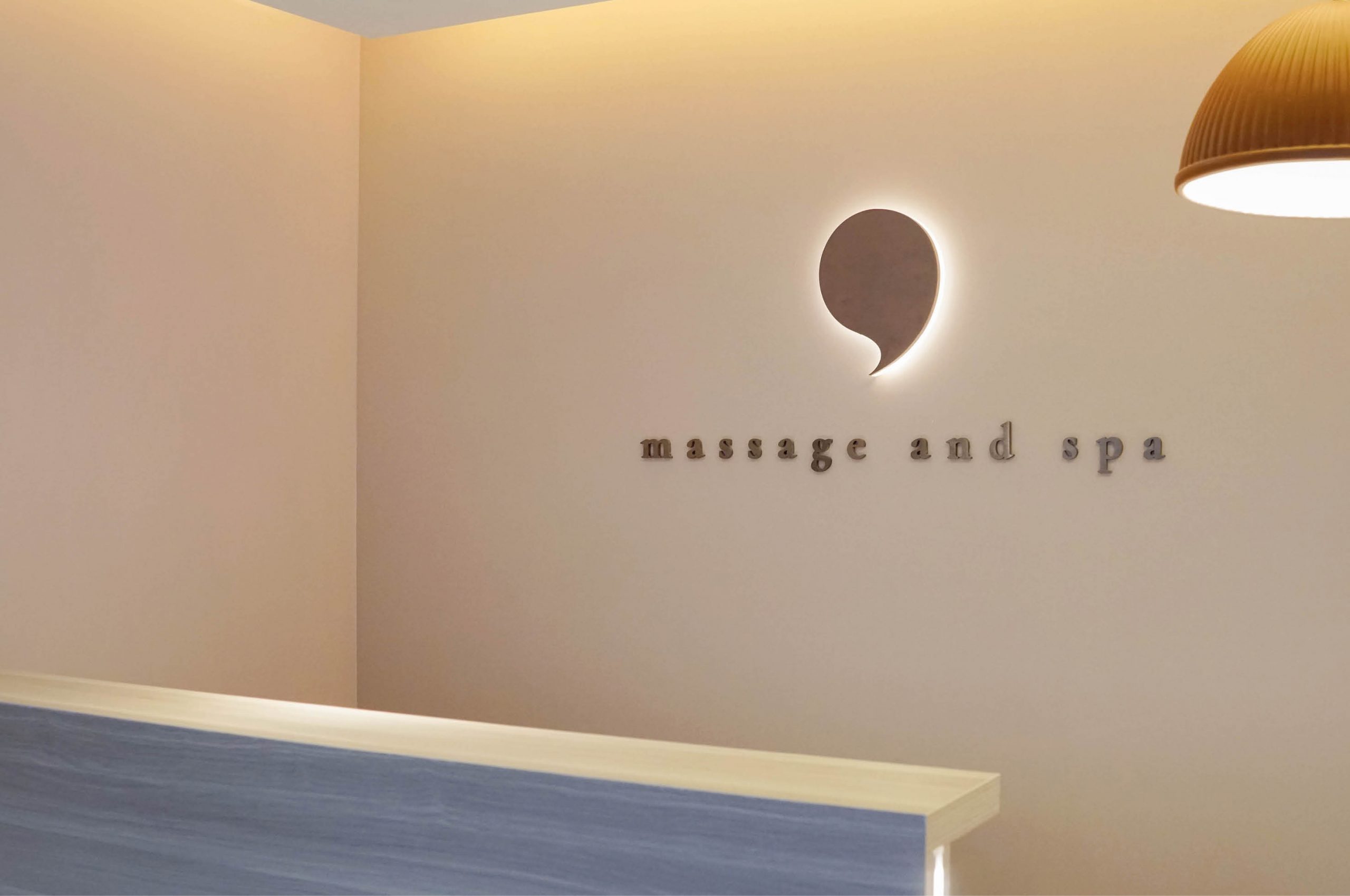
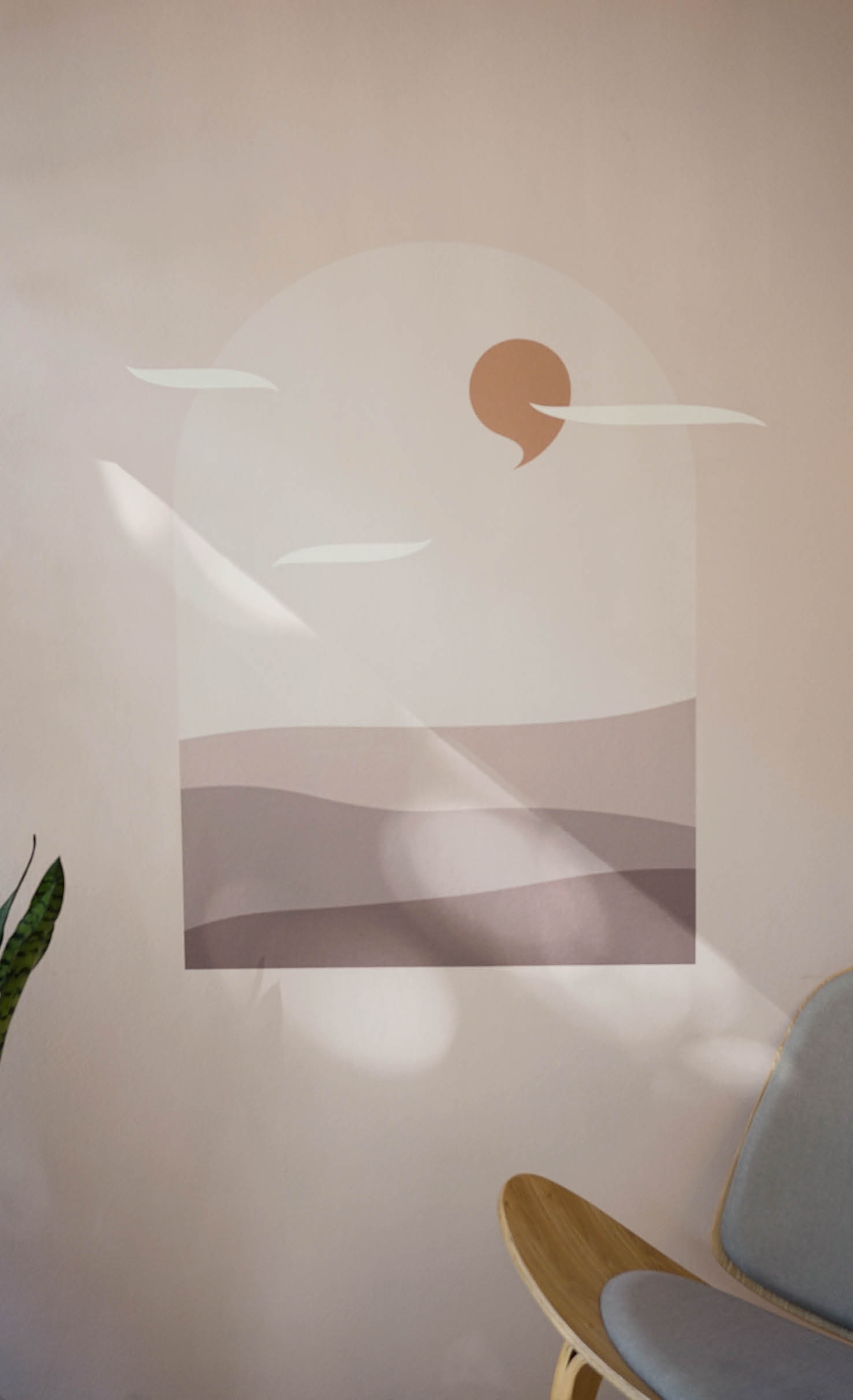
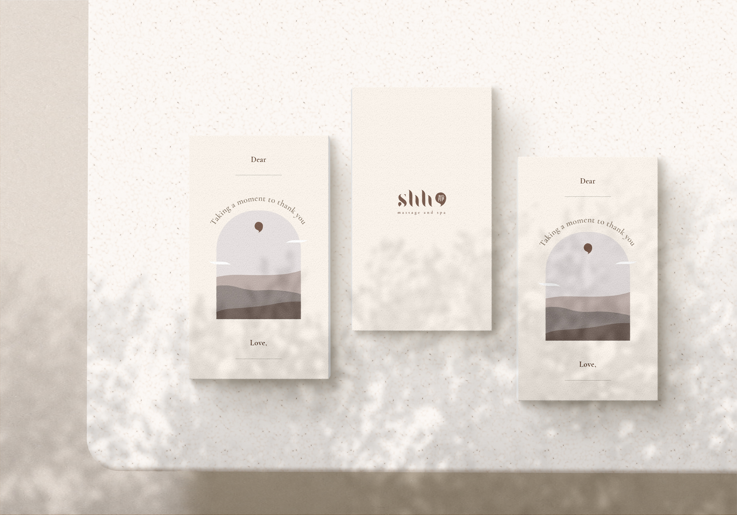
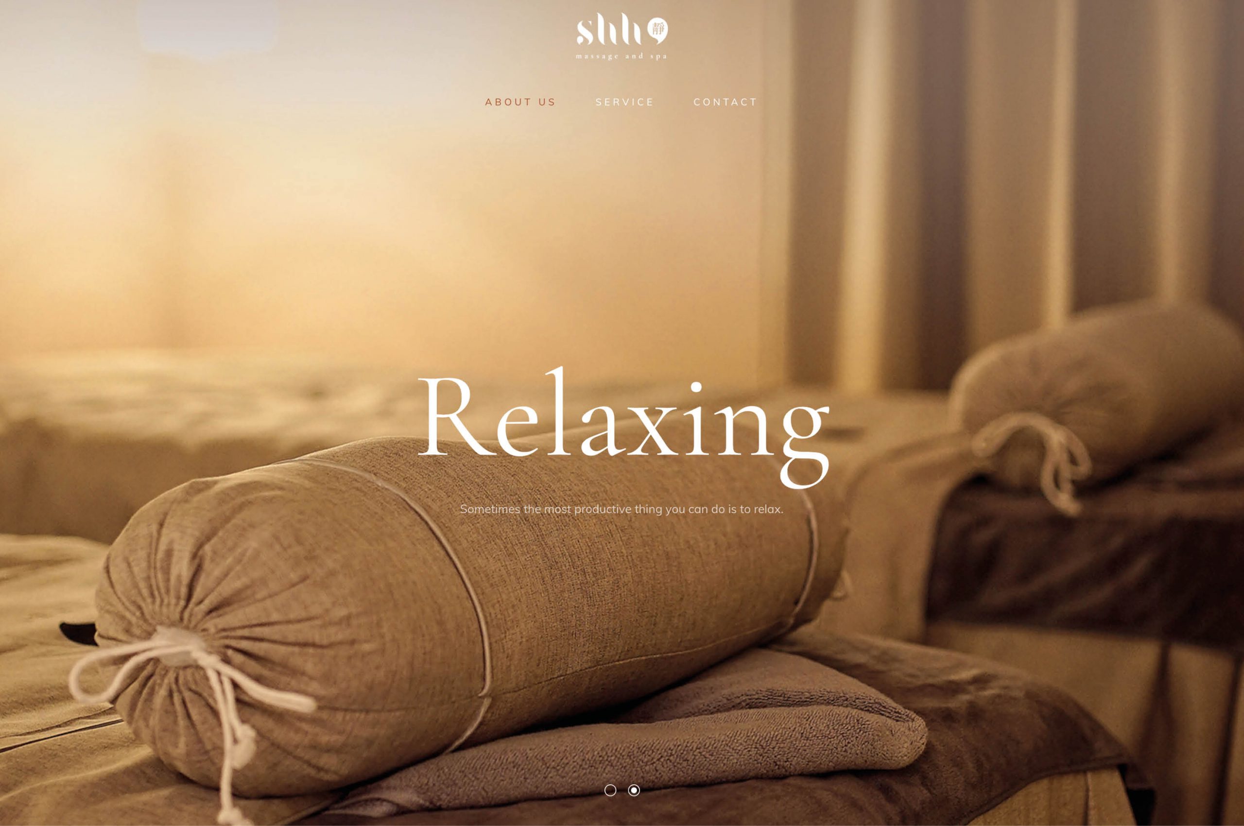
Shh is a massage and spa based in Hong Kong.Shh wants to provide a comfortable space for customers to take a moment to pause in their busy lives and find their inner peace. The smooth curves of the logo like the rippling effect and represent calm while the comma brings out the message of downshifting. A soft colour tone helps to create a cosy atmosphere and the illustration with encouraging quotes will warm the customer’s heart.
靜是一間位於香港的按摩店,同時亦提供美容服務。配合靜心、慢活的概念,商標的線條如水的漣漪,再以逗號佢作點綴,希望顧客來到能暫且停下來,寧聽心靈的聲音,善待自己的身體。店鋪主要使用柔和的色調,配合幾何圖形的插畫和鼓勵性的文案,希望營造出舒適溫暖的氛圍,讓顧客甫踏進門那一剎,靜化心寧,從繁囂中享受恬靜時訂刻。
client
靜shh