year
2019
about
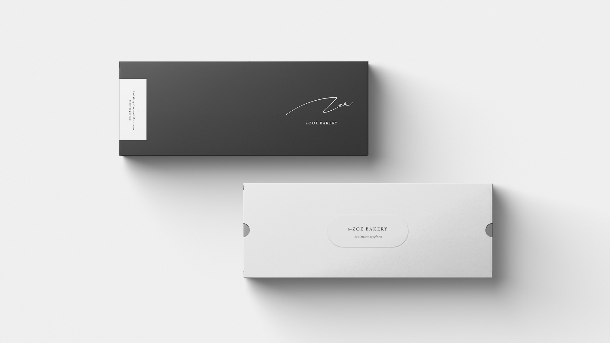
byZOE Bakery is a Hong Kong based bakery by two sweet girls. The brand make use of plain and basic colors like black, grey and white and clear design to present the pure happiness of eating dessert. Clean and clear design also provide a detailed, tidy and focusing brand image for byZOE Bakery. The brand logo shown in an original handwritten font which make the brand even warmer and friendly.
byZOE Bakery 由兩位女孩主理,擅長製作各種精緻甜點及造形蛋糕,希望將食甜品的快樂帶給各人。品牌利用簡單的黑白灰色及簡潔的排版文字為主,寓意甜品所帶來的簡單純粹的快樂,讓煩惱在一瞬間消失。沒有過多的圖案及顏色襯托,讓人將焦點集中於甜點本身上,亦為品牌帶出整潔專注的形象。品牌商標以手寫英文zoe造成,加添人情味及溫暖。
client
byZOE BAKERY